

Beaver Builder Pro is a stable, sober page builder. It ships with the modules most sites actually need, and not much more. PowerPack for Beaver Builder is the add-on that fills the gap. It bolts on 90+ extra modules, a 350+ template library, soft theme-builder features, form stylers for every popular form plugin, and a handful of useful row and column extensions, all hanging off the same Beaver Builder UI you already know.
This article walks through what PowerPack for Beaver Builder actually adds, how to set it up, what to use it for, and (in the second half) the hooks and filters developers can lean on when the panels run out.
Table of Contents
- What PowerPack for Beaver Builder is
- Core features
- Module catalog: what 90+ modules actually means
- The Templates library
- Row, column, and module extensions
- Header, footer, and Theme Builder slice
- Login, register, and Maintenance Mode
- Form stylers explained
- How to install and configure
- Building your first page with PowerPack
- Common use cases
- Developer reference
- WPML, ACF, and WooCommerce
- Performance and compatibility
- Pricing and licensing
- Frequently asked questions
- Final thoughts
What PowerPack for Beaver Builder is
PowerPack for Beaver Builder is a premium add-on plugin made by IdeaBox Creations. It runs alongside Beaver Builder Pro and registers extra modules, row extensions, column extensions, and template assets inside the same Beaver Builder editor. There’s no separate canvas, no separate panel system, and no second set of mental models to learn. You open Beaver Builder on a page, hit the + icon to add content, switch the Group dropdown from "Standard Modules" to "PowerPack Modules", and the new tiles appear in the same place the built-in modules do.
If you’ve used Essential Addons for Elementor or PowerPack for Elementor (no relation to this one despite the shared name), the pattern is identical. The add-on doesn’t replace Beaver Builder. It extends it.
There are two paid add-ons most Beaver Builder users compare PowerPack to. One is Ultimate Addons for Beaver Builder by Brainstorm Force (the team behind Astra and Spectra). The other is Beaver Themer, the official theme-builder add-on from the Beaver Builder team. PowerPack overlaps with both: it has more modules than UABB, and it includes a lightweight subset of Beaver Themer’s "assign a layout as the site header/footer" capability. None of these are mutually exclusive. A lot of sites run Beaver Builder Pro + Beaver Themer + PowerPack together.
Core features
Stripped to the headlines, this is what PowerPack adds to a Beaver Builder site:
- 90+ new modules. Pricing tables, FAQs with schema, image hotspots, image comparison sliders, content tickers, content grids with AJAX filtering, Twitter and Instagram feeds, Facebook page and comments, Google Maps with custom markers, modal boxes, animated headlines, hover cards, info boxes, smart buttons, mega menu, off-canvas menu, table, How-To with schema, countdowns, reviews, business hours, restaurant menu, search form, sitemap, and more. The full list is in the next section.
- 350+ pre-built templates. Whole landing pages and individual sections (hero blocks, feature grids, pricing pages, contact strips, testimonial rows) you can drop into any layout and edit on the canvas. They’re real Beaver Builder layouts, not exported HTML, so every module on them is editable.
- Header, footer, and Maintenance Mode assignment. Build a header layout once, set it as the global header for the site, and PowerPack hooks it into the theme. Same for the footer. Same for a "we’ll be back" maintenance page that role-bypasses for logged-in admins. None of this needs a separate theme builder, though Beaver Themer is still the right tool if you need conditional location rules.
- Custom Login and Register pages. Replace
wp-login.phpand the default registration screen with PowerPack layouts. Brand them however you want. - Form stylers for Contact Form 7, Gravity Forms, Ninja Forms, WPForms, Fluent Forms, Formidable Forms, and Caldera. PowerPack wraps the existing form output in a styled module so you can match fonts, button styles, and field spacing to the rest of your design.
- Row and column extensions. Toggleable row separators (curve, slant, triangle, etc.), expandable rows that collapse to a "click to expand" button, overlay-style row backgrounds, animated background effects, and column-level separators.
- Taxonomy thumbnails. Adds a featured-image field to every taxonomy term so Content Grid / Category Grid modules can show category cards with real images instead of fallback placeholders.
- WPML and Polylang support. Strings from every PowerPack module are registered with WPML for translation. The filter is
pp_wpml_translation_configif you need to extend it.
This is "everything you wished Beaver Builder shipped with but didn’t", roughly.
Module catalog: what 90+ modules actually means
A claim like "90 modules" usually triggers two reactions. One: that’s a lot. Two: half of them are probably reskins of the same thing. The honest answer is somewhere in between. There are duplicates (Hover Cards and Hover Cards 2, Twitter Buttons and Twitter Tweet, Photo Gallery and Filterable Gallery), and there are absolutely modules you’ll never use on a normal site. But the long tail covers the cases page builders typically force you to glue together with custom HTML.
Here’s how the modules are grouped in the panel and what each cluster is actually for.
Content modules
The default selection that comes up when you open the PowerPack group. The ones I reach for repeatedly:
- Pricing Table. Three-tier-style pricing block with feature lists, ribbon labels, and per-tier highlight states. Real pricing-table semantics, not just three styled columns.
- FAQ. Accordion with toggle behaviour and optional FAQPage schema (JSON-LD) baked in. The schema-on-by-default behaviour is filterable, see the developer section.
- Info Box and Info List. "Icon + heading + paragraph" cards in a thousand subtle variations. Used everywhere on feature pages.
- Pricing Table, Coupon, Dual Button, Smart Button. Conversion-page furniture.
- Reviews. Multi-source reviews pulled from Google or Yelp (the API keys live under Integration). Useful for restaurants, dentists, and local services.
- Author Box, Breadcrumbs, Business Hours. Trust signals and metadata that themes used to handle but don’t always anymore.
- Card Slider, Content Grid, Content Ticker, Content Tiles. Different ways to surface posts. Content Grid is the most powerful here: AJAX-loaded post listing with filterable categories, taxonomy-driven queries, custom layouts, and full template control.
- How To. Step-by-step block with HowTo schema attached. Good for tutorials.
- Table. Real styled table module (not pasted HTML) with sticky headers, sortable columns, and responsive collapse.
Creative modules
The visual-impact bucket:
- Image Comparison. Before/after slider with vertical or horizontal handle.
- Image Hotspots. Place tooltips on an image (interior-design before/after, anatomy diagrams, product callouts). Underrated module.
- Image Scroll. A tall image inside a fixed-height frame that scrolls on hover. Effective for landing pages showing a long screenshot.
- Photo Gallery, Filterable Gallery, Logos Grid, Logos Carousel. All the gallery permutations.
- Flipbox. Card that flips on hover to reveal back-side content.
- Hover Cards and Hover Cards 2. Stacked card grids with hover reveals.
- Modal Box. Trigger a popup from any element on the page (button, image, text link).
- Animated Headlines, Fancy Heading. Typewriter / fade / slide animations on the headline.
- Devices. Mockup frames (iPhone, MacBook, iPad) around an image or video.
- 3D Slider, Image Carousel, Card Slider. Three flavours of carousel.
- Notifications. Top-of-page or floating notification bars with timers.
- Announcement Bar. Persistent strip with countdown, optional dismiss button, link out to a sale page.
Form stylers
Wrappers around an existing form plugin’s output that add design controls in the Beaver Builder UI:
- Contact Form 7 Styler
- Gravity Form Styler
- Ninja Form Styler
- WPForms Styler
- Fluent Form Styler
- Formidable Form Styler
- Caldera Form Styler
You still build the form in the form plugin’s own admin. The PowerPack module just renders that form on the page with extra spacing, typography, and button styling controls.
Standalone (no companion plugin needed): Subscribe Form (MailChimp / Mailster), Login Form, Registration Form, Search Form, Form Builder (drag-drop form builder inside PowerPack itself).
Navigation
- Advanced Menu, Mega Menu, Advanced Tabs, Advanced Accordion. The expected menu-and-tab modules with hover states, transitions, and responsive collapse.
- Sliding Menus, Off-canvas Content. Mobile-style drawer menus that work on desktop too.
- Dotnav. Side dots for one-page scroll navigation.
Social
- Twitter (Tweet, Buttons, Grid, Timeline)
- Facebook (Page, Button, Comments, Embed)
- Instagram Feed
- Social Icons, Social Share
Each social module is API-driven and reads its tokens from the Integration tab. If you don’t configure the tokens, the module will still drop into the canvas but won’t render anything until you do.
Layout and utilities
- Spacer, Line Separator, Column Separator, Pullquote.
- Highlight Box. Heading + body + CTA in a colored band.
- Image Panels. Multi-image collage with hover states.
- Restaurant Menu. Two-column item / price / description layout for menus, service lists, or any "name + price + description" use case.
- TOC. Auto-generated table of contents from headings on the page.
- Star Rating. Schema-aware rating block.
- Timeline / Horizontal Timeline / Post Timeline. Time-based vertical or horizontal timelines.
- Coupon. Click-to-reveal coupon code with copy button.
Theme building
- Site Logo, Site Title, Page Logo, Page Title, Search Form, Author Box, Breadcrumbs. Dynamic blocks you’d typically use inside a header/footer layout to print site or page meta.
- Profile Box, User Menu. Logged-in-user display with avatar + linked items.
You won’t use every one of these. Most sites pull from maybe 15 to 25 modules across the catalog. The point of carrying the rest is that when an edge case shows up (you suddenly need an image hotspot, or a restaurant menu, or a coupon reveal), you don’t have to install another plugin to get it.
The Templates library
The Templates tab is the other half of PowerPack’s value proposition. Open Settings -> PowerPack -> Templates and you’ll see two sub-tabs: Page Templates and Row Templates.
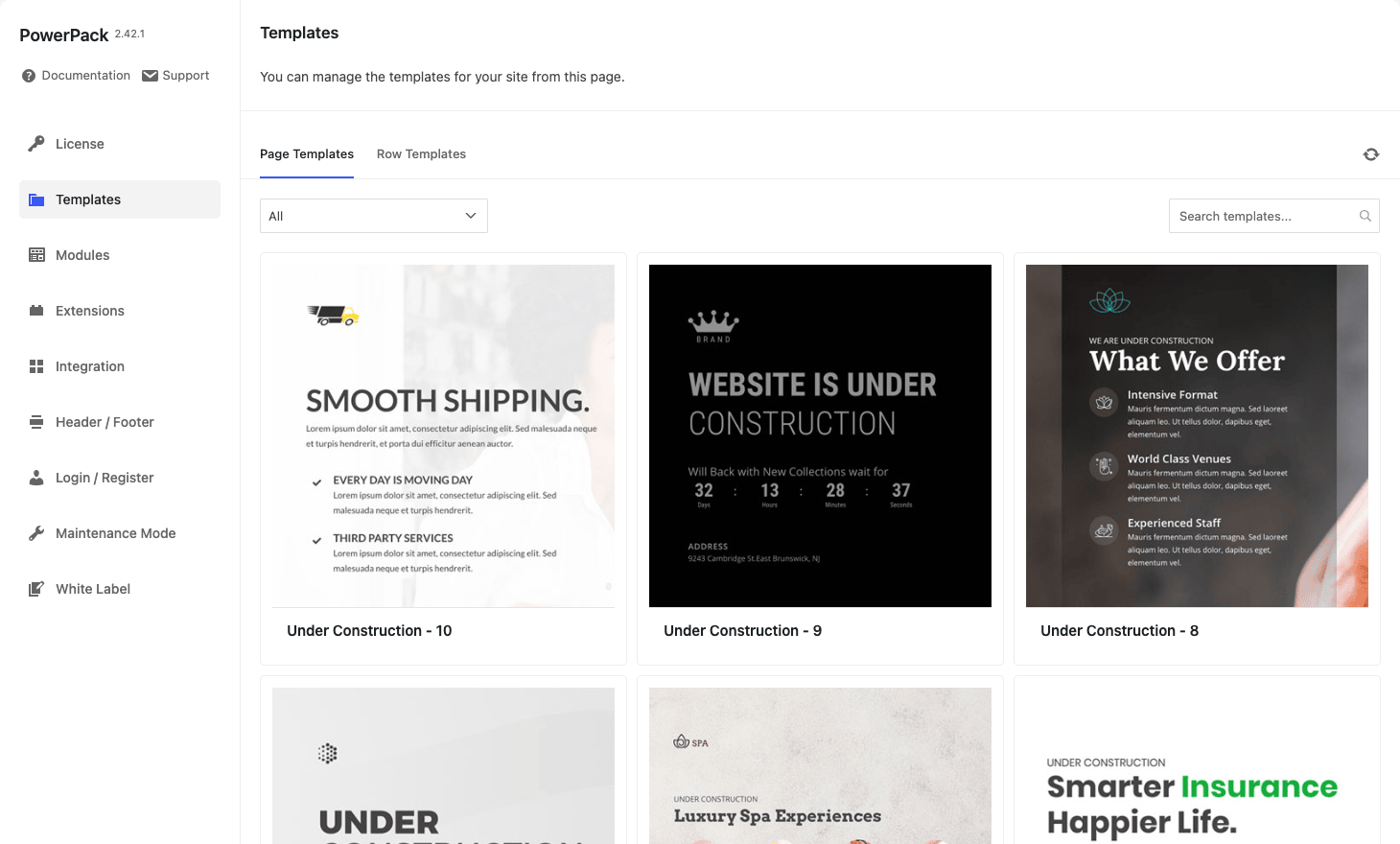
Page Templates are whole landing-page layouts (about us, contact, services, restaurant, agency, fitness, real-estate, app, healthcare, e-commerce). You click one, it imports as a Beaver Builder draft, and you can publish it as-is or replace the copy and images. Each is a real Beaver Builder layout, so every section, row, and module is fully editable in the canvas.
Row Templates are individual sections you drop into an existing layout: hero strips, feature grids with icons, three-up pricing, testimonial carousels, footer-CTA bands, contact-info-with-map sections. Faster to combine than to start with a whole page.
The library is pulled from a remote endpoint at IdeaBox the first time you open the tab, then cached locally. A category filter and search box at the top of the tab help narrow the list if you know what you’re looking for.
The templates are version-managed by IdeaBox, so new ones land periodically without you needing to update the plugin. The downside of that pattern is that an offline staging site can’t see new templates until it reaches the remote endpoint, but that’s a tiny inconvenience and the library is already large.
Row, column, and module extensions
The Extensions tab is the underrated half of PowerPack. These aren’t modules, they’re feature toggles that add new controls to Beaver Builder’s existing Row and Column edit panels.
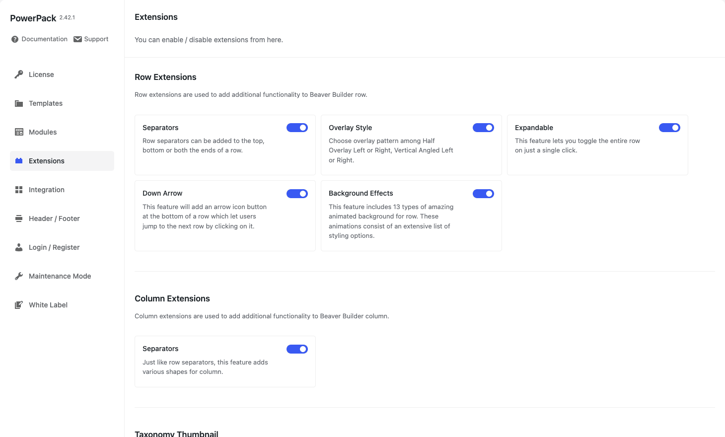
Row Extensions:
- Separators. Add a shape (curve, triangle, slant, wave, mountains, clouds) at the top or bottom of any row. You set color, height, position. Beaver Builder doesn’t ship with this and the typical workaround is a custom SVG background. PowerPack puts the controls in the row edit panel directly.
- Overlay Style. Half-overlay or vertical-angled overlays on row backgrounds. Used for "magazine-cut" layouts where the next row’s background creeps into the previous one.
- Expandable. Collapses a long row to a "Read more" button that expands the row on click. Good for long product copy you don’t want above the fold.
- Down Arrow. Adds a "scroll down" indicator at the bottom of a row that scrolls to the next row when clicked. Pure CSS, no extra JS.
- Background Effects. Thirteen animated row backgrounds (particles, wave, geometric mesh, bubbles, etc.). Use sparingly. Animated backgrounds get old fast.
Column Extensions:
- Separators. Same as row separators but on the column level. Useful when columns inside a row have different backgrounds.
Taxonomy Thumbnail:
- Adds a "thumbnail" image field to every taxonomy term. So when a Category Grid module renders categories on the page, it can show the term’s thumbnail instead of falling back to the first post’s featured image (or worse, a placeholder). The implementation lives in
class-pp-taxonomy-thumbnail.php. You can extend it through thepp_term_thumbnail_url_connection_fieldsfilter (see developer section).
Each extension is toggleable, so on lightweight sites you can disable the row extensions you don’t use and they stop registering their controls in the row edit panel.
Header, footer, and Theme Builder slice
This is where PowerPack starts to look like a mini theme builder.
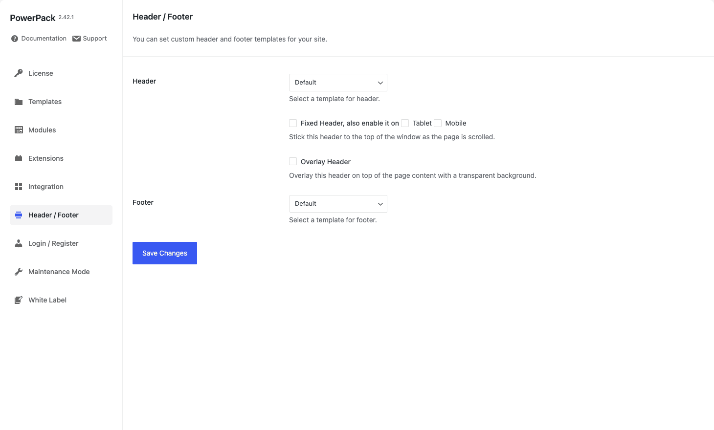
The workflow:
- Create a Beaver Builder page (or row template) that contains the header layout you want: logo, menu, search, CTA button, whatever.
- Go to Settings -> PowerPack -> Header / Footer.
- Pick that page from the Header dropdown.
- Optionally check "Fixed Header" so it sticks on scroll. Optionally enable it on tablet / mobile too.
- Same for the Footer.
PowerPack hooks the chosen layout into the theme’s wp_body_open (or equivalent) action and replaces the theme’s native header. If your theme is Hello Elementor / Astra / GeneratePress / Kadence, this just works. Heavier themes that hardcode their header in header.php without action hooks sometimes need a small bit of customization, see the Compatibility section.
What this doesn’t give you is conditional location targeting. PowerPack assigns one header globally. If you need "this header on blog posts, that header on landing pages, a different one on a custom post type", that’s where Beaver Themer. PowerPack’s slice is the 80% case: one header, one footer, applied site-wide.
Login, register, and Maintenance Mode
Two related features that live near each other under PowerPack settings.
Custom Login / Register pages. Build a normal Beaver Builder page that contains the Login Form and Registration Form modules. Tell PowerPack which page is the login replacement and which is the registration replacement. From then on, requests to wp-login.php and wp-login.php?action=register redirect to your custom-designed pages, but they still log users in through the standard WordPress auth flow. No security drift.
Maintenance Mode. Same pattern. Build a "we’ll be back soon" or "coming soon" page in Beaver Builder, assign it as the maintenance layout, and toggle the mode on. PowerPack will serve that page to public visitors and 503 the rest of the site. Logged-in administrators get through, so you can keep editing. You can tweak which roles bypass via the role checkboxes in the Maintenance Mode tab.
The bypass list is also filterable on the server, so a plugin or mu-plugins file can extend who sees the live site during a coming-soon period.
Form stylers explained
This is the feature that sells PowerPack to agencies. Most form plugins ship with adequate styling controls inside their own admin, but matching the form to the rest of a Beaver Builder design typically means writing custom CSS. PowerPack’s form-styler modules take the existing form output and let you restyle it from inside the Beaver Builder edit panel: typography, field background, focus state, label color, button hover, error messages, success message, spacing.
Configuration is two steps:
- Build the form in the form plugin’s own admin. (You still use Gravity Forms for Gravity-Forms forms, WPForms for WPForms forms, etc.)
- Add the matching PowerPack Form Styler module to the Beaver Builder canvas, pick the form from the module’s dropdown, and style it.
The styler module doesn’t add fields or change validation. It’s a presentation wrapper. If you don’t have the corresponding form plugin active, the styler module is hidden in the panel automatically.
This is also why PowerPack doesn’t have its own "advanced forms" module. The form plugins do that part better, and the styler approach means you don’t get locked into PowerPack’s form storage if you ever switch builders.
How to install and configure
Standard WordPress plugin install:
- Make sure Beaver Builder (or Beaver Builder Pro) is already installed and active. PowerPack will not load its modules without it.
- Upload the PowerPack zip via
Plugins -> Add New -> Upload Plugin, then Install + Activate. - Open
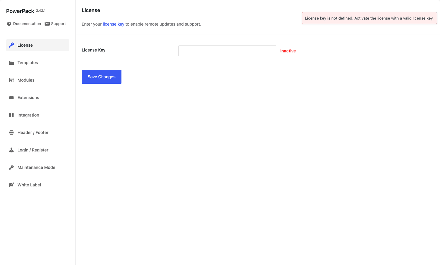
Settings -> PowerPack. - On the License tab, paste your license key and Save Changes. (the GPL-licensed version skips this; just leave the field blank, everything still works.)
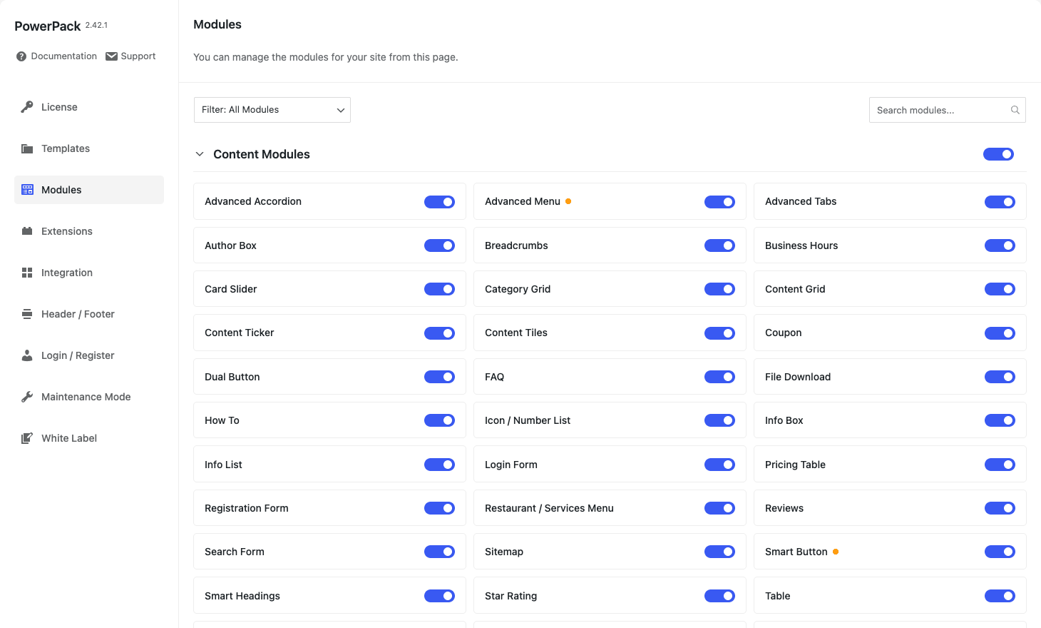
- Hop over to the Modules tab. By default, every module is enabled. If you know you won’t use, say, Caldera Form Styler or the Facebook Comments module, switch them off here. Disabled modules don’t load their CSS or register in the panel, which keeps the editor snappier.
- Open the Extensions tab. Enable Row Separators if you use them. Enable Background Effects if you use them. Disable anything you don’t.
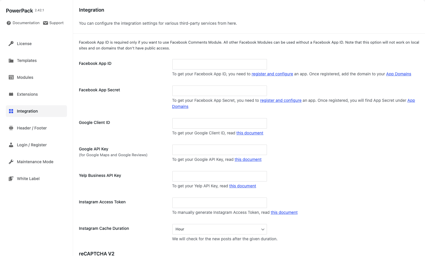
- If you’ll use Google Maps, Google Reviews, Yelp Reviews, Facebook Pages, Instagram Feed, or reCAPTCHA, fill in the keys on the Integration tab. None of these are required for normal page-building; they’re only required if you use the corresponding module.
- (Optional) Configure Header / Footer if you want PowerPack to provide your site header and footer.
- Open Beaver Builder on any page and you’ll see "PowerPack Modules" as a Group option in the add-content panel.
That’s it. There’s no separate onboarding wizard, no module-discovery walkthrough. The plugin assumes you already know Beaver Builder, which is fair.
Building your first page with PowerPack
The first time you open Beaver Builder after activating PowerPack, hit the + icon to open the content panel, then switch the Group dropdown from "Standard Modules" to "PowerPack Modules". You’ll see the module grid split into categories: Content, Creative, Form, Social, Navigation, Theme Building, etc.
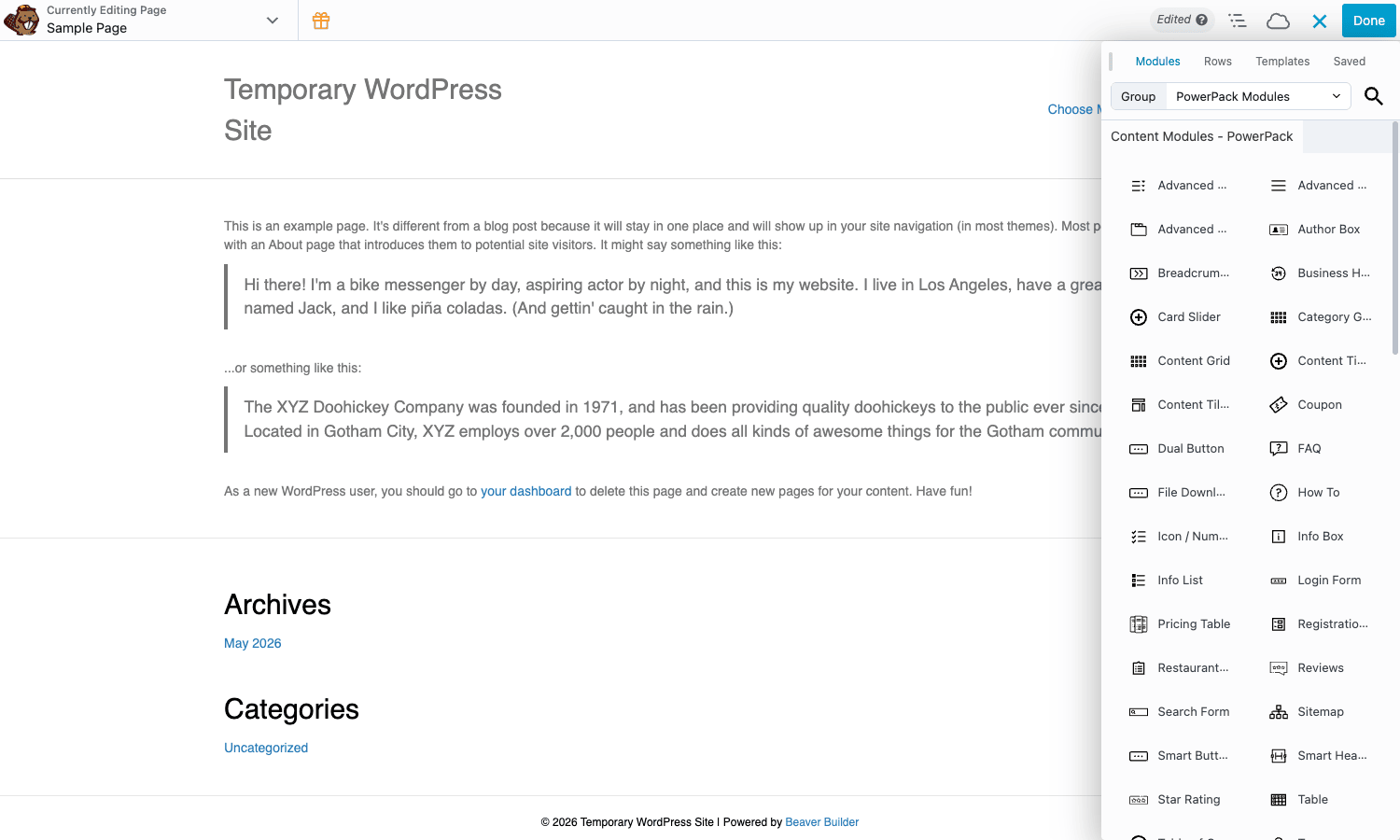
Drag any module onto the canvas the same way you’d drag a built-in Beaver Builder module. The module settings panel that opens on the right is the same UI as Beaver Builder’s. The fields, color pickers, typography controls, responsive toggles, and field connections (for ACF Pro) all behave identically.
For a typical landing page you’d lay out:
- A row at the top with Page Title Bar or Heading + Smart Button.
- A feature grid using three Info Boxes or one Content Grid pointed at a custom post type.
- Pricing Table for tiers.
- FAQ with schema enabled.
- Reviews or Testimonials.
- A contact section with Gravity Form Styler (or whichever form plugin you use) + Google Map + Business Hours.
Save, publish. The page renders without you ever leaving the Beaver Builder canvas.
Common use cases
A short list of where PowerPack tends to pay for itself.
1. Restaurant or local-business site
Restaurant Menu module for the food list, Business Hours module for opening times, Google Map for directions, Reviews module pulling from Google or Yelp, Image Gallery for the photos, a styled Contact Form 7 form for reservations. All of that is in PowerPack, no other plugins needed.
2. Agency or services landing page
Hero row with Animated Headline + Smart Button. Three-column feature grid using Info Box. Pricing Table for service tiers. Testimonials carousel. Logos Grid with client logos. Filterable Gallery for portfolio pieces. FAQ with schema. A row of Hover Cards for the team. Final CTA row with Highlight Box. PowerPack carries every piece of that.
3. Real-estate or property listings
Content Grid pointing at a "property" custom post type, with category filter chips, AJAX-load-more, a custom layout template that shows price + beds + baths + featured image. Image Hotspots on floor plans. Modal Box trigger for "request a viewing". Mega Menu for the top nav.
4. Course / learning landing page
How-To module with HowTo schema for "how this course works". Pricing Table for one-time vs subscription. Countdown for enrollment deadline. FAQ with schema. Testimonials carousel. Subscribe Form for the waitlist. Reviews module.
5. SaaS marketing site
Smart Button rows for sign-up CTAs. Devices module to frame product screenshots in a laptop or phone. Feature grid with Info Boxes. Comparison Table (using the Table module) for "us vs them". Image Comparison slider for before/after. Pricing Table. Logo grid for "trusted by". Modal Box for video demo.
6. Blog or magazine layout
Posts modules (Content Grid, Content Tiles, Smart Posts, Post Timeline) for category landing pages. TOC module for long articles. Author Box at the bottom of posts. Social Share buttons. Related-posts grid as a Content Grid filtered by current post’s category.
You don’t need PowerPack to do any of these on Beaver Builder. You could build all of it with the standard modules + custom HTML + custom CSS. PowerPack just gives you each pattern as a named module so you stop reinventing them on every project.
Developer reference
PowerPack runs on Beaver Builder, which means most of the developer ergonomics you already know from BB apply directly: every module is a class, settings are filterable, the field schema is filterable, and module rendering hooks into Beaver Builder’s normal lifecycle. PowerPack adds a layer of its own hooks on top, mostly prefixed with pp_ or pp_post_.
This section walks the hooks that I’ve found most useful in practice. The plugin exposes 20+ filters and a dozen actions; this is a representative subset, not a full reference.
Filter: pp_admin_settings_tabs
Add a custom tab to the PowerPack settings screen. Useful for agencies adding a "Custom" tab with site-specific options.
add_filter( 'pp_admin_settings_tabs', function( $tabs ) {
 $tabs['agency'] = array(
 'title' => __( 'Agency', 'my-textdomain' ),
 'icon' => '<span class="dashicons dashicons-businessman"></span>',
 'show' => true,
 'cap' => 'manage_options',
 'file' => WP_PLUGIN_DIR. '/my-plugin/views/agency-tab.php',
 'priority' => 300,
 );
 return $tabs;
} );
The tab renders by including the file you point to. From there you can wp_options, REST, or anything else you want.
Filter: pp_load_modules_in_admin
By default PowerPack registers its modules on every admin page so dropdowns in plugins that scan registered builders see them. On admin-heavy sites that boots a lot of PHP for nothing. Turn it off if you’ve measured a problem.
add_filter( 'pp_load_modules_in_admin', '__return_false' );
The Beaver Builder editor still registers them on the frontend builder load, so the user-facing experience is unaffected.
Filter: pp_faq_schema_markup and pp_faq_schema_force_render
The FAQ module ships FAQPage JSON-LD schema by default. Two filters control it.
// Tweak the schema payload before render.
add_filter( 'pp_faq_schema_markup', function( $schema, $settings ) {
 $schema['publisher'] = array(
 '@type' => 'Organization',
 'name' => get_bloginfo( 'name' ),
 );
 return $schema;
}, 10, 2 );

// Force the schema to render even if it was already rendered once on the page.
add_filter( 'pp_faq_schema_force_render', '__return_true' );
The default behaviour is "render schema exactly once per page". If you have two FAQ modules on the same page and want both schemas concatenated, force_render is the lever.
You can also fully disable FAQ schema by returning false from pp_faq_schema_markup.
Filter: pp_post_disable_schema
The Content Grid / Smart Posts modules emit Article schema for each posted item. If your SEO plugin (Rank Math, Yoast, AIOSEO) is already emitting Article schema for those URLs, you’ll want PowerPack to stop, otherwise you ship duplicate schema.
add_filter( 'pp_post_disable_schema', '__return_true' );
This is one of the more common filters to set when migrating into a site that has an SEO plugin handling structured data.
Filter: pp_post_grid_ajax_query_args
The Content Grid module loads posts via AJAX with filterable categories, paginated load-more, and a search box. The AJAX args are filterable so you can inject custom meta_query / tax_query / orderby rules.
add_filter( 'pp_post_grid_ajax_query_args', function( $args ) {
 // Hide all posts marked as "noindex" by Rank Math from Content Grid.
 $args['meta_query'][] = array(
 'key' => 'rank_math_robots',
 'value' => '"noindex"',
 'compare' => 'NOT LIKE',
 );
 return $args;
} );
Pair this with pp_post_grid_ajax_before_query and pp_post_grid_ajax_after_query (actions, not filters) if you need to log or trace which queries are running.
Filter: pp_cg_module_layout_path
The Content Grid module renders each item using a layout template (the same way WordPress themes render posts). You can override the path to swap in a custom template.
add_filter( 'pp_cg_module_layout_path', function( $path, $layout, $settings ) {
 if ( $layout === 'grid' && get_post_type() === 'property' ) {
 return get_stylesheet_directory(). '/pp/custom-property-grid.php';
 }
 return $path;
}, 10, 3 );
This is the pattern you’d use to make Content Grid render a custom card layout for a custom post type without forking the module.
Filter: pp_post_grid_ajax_response
Last-mile filter on the AJAX response HTML. Use it to wrap or clean the markup before it goes back to the browser.
add_filter( 'pp_post_grid_ajax_response', function( $response, $settings, $query ) {
 $response['html'] = preg_replace( '/<style[^>]*>.*?<\/style>/is', '', $response['html'] );
 return $response;
}, 10, 3 );
Filter: pp_header_footer_should_render
Gate whether PowerPack’s assigned header/footer renders on a given request. Useful for excluding the header/footer on landing pages, popup pages, or AMP variants.
add_filter( 'pp_header_footer_should_render', function( $should ) {
 if ( is_singular( 'landing_page' ) ) {
 return false;
 }
 return $should;
} );
Filter: pp_wpml_translation_config
Tweak which fields PowerPack hands to WPML for translation. Useful when you’ve added a custom field to a module via pp_module_ui_setting_fields and want it translated automatically.
add_filter( 'pp_wpml_translation_config', function( $config ) {
 $config['module']['my-custom-module']['fields'][] = array(
 'name' => 'my_custom_text',
 'translate' => true,
 );
 return $config;
} );
Action: pp_admin_settings_save
Fires when an admin clicks Save Changes on any PowerPack settings tab. Useful for triggering a re-cache, an external API ping, or a custom audit log.
add_action( 'pp_admin_settings_save', function() {
 delete_transient( 'my_site_settings_cache' );
 do_action( 'my_plugin/powerpack/settings_changed' );
} );
Filter: pp_module_ui_setting_fields
Extend the shared "UI Setting Fields" tab that every PowerPack module includes (animation, scroll behaviour, accessibility hooks). Use it to add a site-wide option that should appear on every PowerPack module.
add_filter( 'pp_module_ui_setting_fields', function( $fields, $settings ) {
 $fields['agency_label'] = array(
 'type' => 'text',
 'label' => __( 'Internal label (not shown to visitors)', 'my-td' ),
 'default' => '',
 );
 return $fields;
}, 10, 2 );
This is the agency-friendly pattern for adding an internal label to every module so your team can grep layouts later.
WP-CLI
PowerPack ships one WP-CLI command for license activation:
wp powerpack register --license=YOUR_LICENSE_KEY
wp powerpack register --deactivate
Useful when you’re scripting site provisioning. the GPL-licensed version doesn’t need a license at all.
WPML, ACF, and WooCommerce
These three integrations are common enough to call out separately.
WPML. PowerPack registers its module string fields with WPML’s translation config so you can localize module-level copy without writing your own xliff exports. The class is BB_PowerPack_WPML_Compatibility. The filter pp_wpml_translation_config lets you extend the field map when you’ve added a custom field to a module. Polylang follows a similar pattern through Polylang’s own string registration; PowerPack works with both without any explicit config.
ACF / ACF Pro. Every PowerPack module that accepts text, image, or color input supports Beaver Builder’s "Field Connection" feature. You click the connection icon next to the input and pick an ACF field. The module then renders whatever the current post’s ACF value is at render time. This is the foundation for using PowerPack alongside Beaver Themer to build templates that adapt to the post being viewed.
WooCommerce. PowerPack doesn’t ship dedicated WooCommerce product modules (no "Product Grid" or "Mini Cart" in this plugin), but the Content Grid module can query the product post type, filter by product category, and order by price / popularity / date. For full WooCommerce display flexibility you’d combine this with WooCommerce’s own shortcodes and blocks. The point of PowerPack on a WooCommerce site is the marketing surface (landing pages, FAQ, pricing tables, comparison tables), not the catalog itself.
Performance and compatibility
The honest version, not the marketing version.
Asset loading
PowerPack module CSS and JS are split per-module and conditionally enqueued. If a page doesn’t use the Reviews module, the Reviews CSS doesn’t load on that page. This is built on top of Beaver Builder’s existing per-page asset compilation, so as long as you’re on a Beaver Builder version that ships separate per-layout CSS, this just works.
What does add weight on every page where a PowerPack module is present is the small shared base CSS (~30-50KB depending on which modules are active). Reasonable for what you get, but worth knowing about.
JavaScript
Module-specific JS loads only on pages that use that module. The exceptions are global features (Off-canvas Menu, Maintenance Mode bypass, the Search Form’s keyboard shortcut) which add small amounts of JS site-wide if you’ve configured them.
Caching plugins
PowerPack plays well with caching plugins for static content. AJAX-driven modules (Content Grid with load-more, Reviews with live API fetch) bypass the cache for their AJAX endpoints, which is correct. If you’re caching aggressively and seeing stale content in Content Grid, check that your cache plugin isn’t caching the admin-ajax.php response.
Theme compatibility
PowerPack assumes the theme exposes a hookable header (wp_body_open action) and a hookable footer (wp_footer). Hello Elementor, Astra, GeneratePress, OceanWP, Kadence, Storefront, Twenty Twenty-Three, Twenty Twenty-Four, and the Beaver Builder Theme all work out of the box. Older custom themes that hardcode <header> in header.php without action hooks may need a small modification. The plugin includes shims for the Beaver Builder Theme specifically (fl_before_footer_widgets, fl_after_footer, etc.) under classes/theme-support/.
Edge cases worth knowing
- Schema duplication. If your SEO plugin emits Article schema and PowerPack’s Content Grid / Smart Posts are also emitting Article schema, you’ll get two of each. Use
pp_post_disable_schemato silence PowerPack. - FAQ schema rendered twice. Two FAQ modules on the same page only emit schema once by default. Use
pp_faq_schema_force_renderto change that. - Reviews module rate limits. Google Maps Reviews API has a daily quota. On a site with high traffic you’ll hit the limit unless you enable PowerPack’s review caching (Integration tab -> Instagram Cache Duration / Reviews Cache settings).
- Header / Footer doesn’t show. If you’ve set a header and it’s not appearing, the theme likely doesn’t fire
wp_body_open. Add<?php do_action( 'wp_body_open' );?>after the opening<body>tag in the theme. - Animated background effects on mobile. Particle and mesh effects are heavy on low-end devices. Test on a slow phone before shipping.
Pricing and licensing
PowerPack is sold by IdeaBox Creations under a tiered license model (Starter, Professional, Business / Agency), with each tier permitting more sites. The Professional tier is the popular pick for freelancers and small agencies. All tiers include the same modules and templates; the price difference is purely site-count and length of update access.
This is a commercial GPL plugin, which means the code is GPL but the official build (with update access, support, and the template-library remote endpoint) is paid. You install it, all 90+ modules are available, the templates load, and the editor behaves the same as a licensed copy. If you want premium support, the official IdeaBox license is still the way to go.
The PowerPack for Beaver Builder build sold here is the simplest path if you want every module and the full template library on a real WordPress install without paying for a yearly license up front.
Frequently asked questions
Is PowerPack for Beaver Builder a separate page builder?
No. It’s an add-on that runs inside Beaver Builder. You still build pages in the Beaver Builder editor; PowerPack adds new modules and new buttons inside it.
Do I need Beaver Builder Pro, or is the free Beaver Builder Lite enough?
Beaver Builder Lite works for basic module addition. Some of PowerPack’s modules (the post-grid family, the form stylers for premium form plugins, the header/footer assignment) lean on features that only exist in Beaver Builder Pro. Practical answer: pair PowerPack with Beaver Builder Pro.
How does PowerPack compare to Ultimate Addons for Beaver Builder (UABB)?
UABB (by Brainstorm Force) is the other major add-on. The two plugins overlap heavily. PowerPack has more modules (90+ vs UABB’s ~70). UABB has a slightly tighter integration with Astra-specific features. Both are well-maintained. Most teams pick one based on which interface they prefer and stick with it. There’s no technical reason you can’t run both, but you’d be paying for a lot of duplication.
How does PowerPack compare to Beaver Themer?
Beaver Themer is the official theme-builder add-on from the Beaver Builder team. It does conditional location targeting (this header on these post types, that template on those archive pages, dynamic singular templates for any post type or term). PowerPack’s "Header / Footer" tab is one global header and one global footer with no conditional rules. If you need conditional templates, get Beaver Themer. Many sites run both.
Does PowerPack work with Elementor?
No. Different page builder. The Elementor world has its own ecosystem of add-on plugins, including Essential Addons for Elementor and Premium Addons Pro. If you’re shopping page builders, Beaver Builder and Elementor are both solid; pick one and commit. PowerPack is only for the Beaver Builder side of the fence.
Will disabling unused modules speed up my site?
Slightly. Disabled modules don’t register on the frontend and don’t load their per-module assets, so an editor with fewer registered modules opens marginally faster. The frontend benefit is smaller because PowerPack already loads module CSS / JS conditionally per page. On a 90-module install where you use 15, disabling the other 75 is good hygiene but not a dramatic perf win.
Can I use PowerPack for site headers and footers without Beaver Themer?
Yes. PowerPack’s Header / Footer tab lets you assign a Beaver Builder layout as the global header or footer. It’s a simpler scope than Beaver Themer (no conditional location targeting), but if you only need one header and one footer site-wide, it’s enough.
Does the templates library work offline?
The first time you open the Templates tab, PowerPack pulls the catalog from a remote endpoint at IdeaBox. After that, the catalog is cached locally. Importing a specific template still requires a one-time fetch from the remote endpoint, so a fully air-gapped server won’t be able to install new templates. Local templates you’ve already saved to the site work offline.
Does it support WPML and multi-language sites?
Yes. PowerPack ships with WPML compatibility built in (see class-pp-wpml-compatibility.php). Module strings register with WPML’s string table automatically. Polylang works through Polylang’s own string discovery. The pp_wpml_translation_config filter lets you tweak the field map when needed.
How do I disable PowerPack’s schema output if my SEO plugin already handles it?
Set pp_post_disable_schema to true. That kills the Article schema PowerPack emits from Content Grid / Smart Posts. For FAQ schema, return false from pp_faq_schema_markup (or set the per-module schema toggle to off in the module settings).
Can the form stylers be used without owning the corresponding form plugin?
No. The WPForms Styler needs WPForms. The Contact Form 7 Styler needs Contact Form 7. The styler module is a wrapper around an existing form plugin’s output. PowerPack does include its own standalone Form Builder, Subscribe Form, Login Form, Registration Form, and Search Form if you’d rather not install a separate form plugin.
Will PowerPack slow down the Beaver Builder editor?
In an editor with all 90+ modules registered, the panel takes about a second longer to populate than a stock Beaver Builder install. Disabling the modules you don’t use cuts most of that. On modern hardware the difference is barely noticeable.
Final thoughts
The honest reason to run PowerPack alongside Beaver Builder is that Beaver Builder’s design philosophy is restraint. The base plugin ships with the modules most sites need, and not the long tail. That’s a feature, not a bug, but it leaves you reaching for HTML and custom CSS when the long tail shows up. PowerPack covers that tail.
It is not, and shouldn’t be, the only add-on you ever need. If you build conditional templates, you’ll still want Beaver Themer. If you use ACF Pro for content modelling, that’s a separate (and complementary) plugin. If you’re on a Divi, Elementor, or Bricks site, this isn’t the right tool at all; pick one of their add-on packs. But if you’ve already committed to Beaver Builder, PowerPack is the single most useful thing you can install on top of it.
For developers: the filter surface is reasonable, the schema is filterable, the AJAX queries are filterable, and the modules slot into Beaver Builder’s existing class hierarchy without weird inheritance. It’s not the most elegant codebase I’ve ever read, but it’s normal WordPress plugin code and easy to extend. The official documentation at wpbeaveraddons.com covers the user-facing side, and WordPress.org plugin developer reference covers the underlying APIs PowerPack’s hooks build on.