

Numbers in a paragraph are forgettable. The same numbers in a chart, with a colored line trending up and a tooltip on each data point, get remembered and shared. WordPress doesn’t ship a chart builder, so most authors paste a screenshot of a spreadsheet and hope readers squint at it. There’s a better way, and it’s been around for years.
Visualizer Charts and Graphs is Themeisle’s chart builder for WordPress. It takes data from a CSV, a Google Sheet, a JSON URL, a WordPress query, or even a custom database table, and renders it as one of 16+ interactive chart types you can drop into any post with a shortcode or a block. This post walks through the whole thing, from your first pie chart to writing PHP filters that change how the database query is built.
Table of contents
- What Visualizer is
- Why a dedicated chart plugin instead of an image
- Core features at a glance
- Installing and activating
- Building your first chart
- Picking the right data source
- Embedding charts in posts and pages
- Global settings and per-chart styling
- Real-world use cases
- Developer reference: hooks, filters, and code
- Performance, accessibility, and SEO
- Pricing and what GPL Times provides
- Frequently asked questions
- Final thoughts
What Visualizer is
Visualizer is a WordPress plugin from Themeisle (the team behind Neve and Otter Blocks) that lets you build charts inside the WordPress admin and embed them in posts, pages, or any block-enabled area. Under the hood it sits on top of three well-known rendering libraries:
- Google Charts for the bulk of the chart types (line, bar, pie, geo, candlestick, gauge, scatter, combo, etc.).
- Chart.js for a more modern look on line, bar, donut, polar, and radar charts.
- DataTables for interactive sortable, filterable, paginated tables.
You don’t have to know any of those libraries to use the plugin. The admin wizard lets you pick a chart type, drop in your data, tweak colors and labels, and copy a shortcode. The libraries are only relevant if you want to dig in and override defaults via PHP, which we cover later.
I’ve spent the past few days using it on a fresh WordPress install, building charts from a hand-typed table, a remote CSV, and a database query. The screenshots below are all real, not stock images.
Why a dedicated chart plugin instead of an image
You can absolutely make a chart in Excel, screenshot it, and paste the PNG into a post. People do this every day. The problems show up the moment the data changes or someone visits on a phone:
- The image is fixed size. On a small screen the text shrinks until it’s unreadable.
- Updating the chart means redoing the screenshot, re-uploading, replacing the URL in the post.
- Search engines can’t read the values inside an image, so a chart that ranks for "global solar capacity 2024" doesn’t help anyone find your post.
- Tooltips, hover labels, filtering, and download-as-CSV are not possible with a static PNG.
Visualizer outputs real HTML and SVG. The chart resizes with the browser, the data lives in a small JSON object you can edit any time, and you can attach schema.org metadata so search engines understand what the chart is about. The frontend even includes optional action buttons for Print, CSV, Excel, Copy, and Download Image so a reader can grab the underlying data with one click.
Core features at a glance
A quick bullet list before we get into the walkthrough.
- 16+ chart types across three libraries. Line, column, bar, area, pie, donut, geo, gauge, scatter, candlestick, combo, polar area, bubble, timeline, treemap, table, DataTable.
- Seven data sources. Manual entry, CSV upload, CSV from URL, Google Spreadsheet URL, JSON URL, WordPress posts query, and database tables (Pro).
- Auto-refresh schedules. Charts can refetch their data every 10 minutes, hour, 12 hours, day, or 3 days via WP-Cron.
- Shortcode and Gutenberg block. Plus an Elementor widget for page-builder fans.
- Frontend export buttons. Print, CSV download, Excel download, copy to clipboard, save as image.
- Lazy loading. Each chart can defer rendering until it scrolls into the viewport, which keeps initial page weight low.
- Schema.org JSON-LD. Charts emit structured data including name, description, creator, and license fields.
- WPML and Polylang ready. Chart titles and labels translate per language.
- Pro extras. Custom database queries, frontend chart editor, per-role permissions, scheduled imports, premium support.
Installing and activating
You install Visualizer like any other WordPress plugin.
- Go to Plugins -> Add Plugin in your WordPress dashboard.
- Search for "Visualizer Charts and Graphs". The free version from Themeisle has over 60,000 active installs.
- Click Install Now, then Activate.
- If you have the Pro addon, upload its ZIP via Plugins -> Add Plugin -> Upload Plugin, install, and activate it. The Pro addon is a separate file that extends the free plugin; both must be active.
Once active, a new Visualizer menu appears in the left sidebar with three sub-items: Chart Library, Add New Chart, Settings, plus Support and About Us links. The free plugin works out of the box.
Building your first chart
Click Add New Chart. The first prompt asks which builder you’d like to use, the classic step-by-step wizard or the newer AI Chart Builder. Pick Classic Builder for now (we’ll come back to AI later).
You then see a grid of chart types in three tabs: Google Charts, ChartJS, and DataTable. Pick the shape that fits your data. Some quick guidance:
- Line, Area, Column for trends over time.
- Bar for comparing categories where the labels are long (horizontal layout reads better).
- Pie / Donut for showing proportion of a single total, capped at maybe five or six slices.
- Geo for country / region data, with shading.
- Scatter / Bubble for correlation between two or three numeric dimensions.
- Candlestick for OHLC stock data.
- Gauge for a single KPI value with thresholds.
- Table / DataTable when the chart is really a table and you want sorting and filtering.
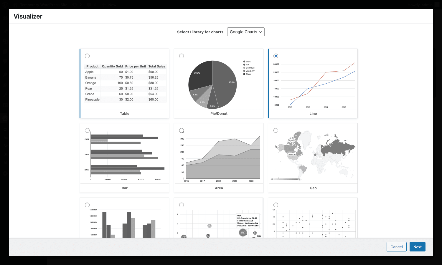
Select Line for the example and click Next. The wizard drops you into the chart editor with sample data already loaded so you can see what a chart looks like before you replace it with yours.
The chart editor layout
The editor is split into three parts:
- Top right: the shortcode you’ll paste into a post, plus a "Backend chart title for internal usage" field. This title is only used in the chart library; the chart’s visible title is set under Settings.
- Right column tabs: Source, Settings, Help. Source is where data comes in; Settings is where you customize everything visual.
- Left column: a live preview of the chart that updates whenever you change data or settings.
Source is the first tab you’ll use. It has six (Pro: seven) collapsible panels, one per data source:
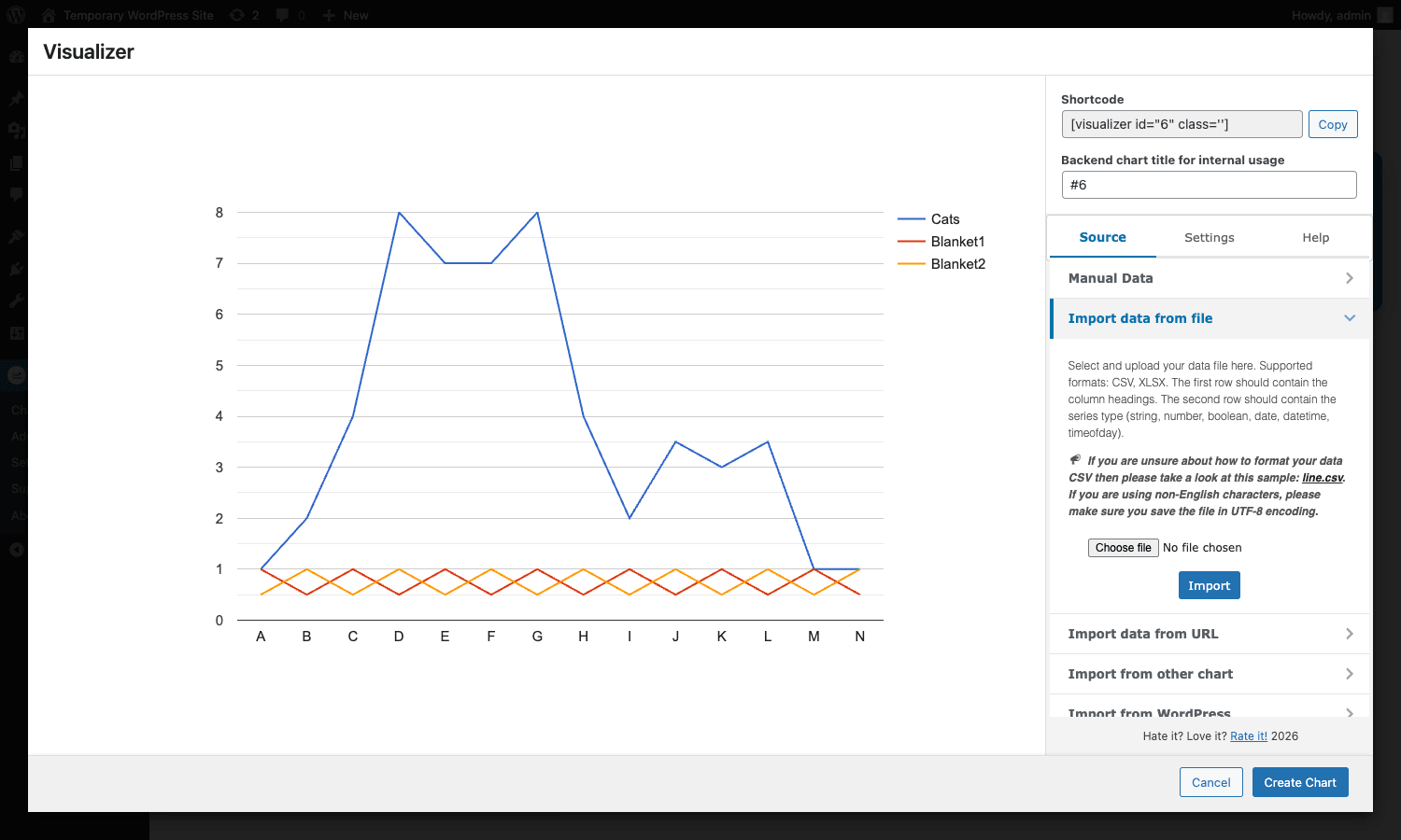
Pick a panel, configure the source, click "Show Chart", and the live preview redraws.
Filling in data
For the example, click Manual Data. A button labeled "Text editor" opens a spreadsheet-style table where you can type rows directly. The first row holds column headers; the second row holds the data type for each column (string, number, date, datetime, timeofday, boolean). The remaining rows are your data. There’s also Excel-paste support, so if you have a Google Sheet open in another tab you can copy a range and paste it straight in.
Click Save in the data editor, then Show Chart back in the source panel, and the preview redraws with your data. From here you’d switch to the Settings tab to label axes, set colors, hide the legend, and so on.
Settings: where most of the time goes
The Settings tab is a long accordion of customization panels. Below is the chart editor with Settings open:
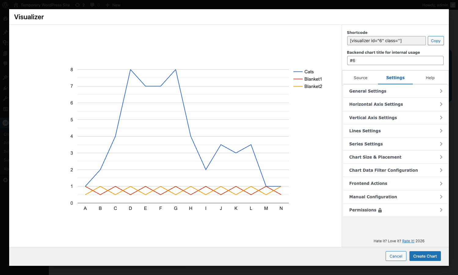
A quick tour:
- General Settings: chart title and its position, font family, legend placement, tooltip behavior, animation timing and easing, license and creator (used in schema.org), save-as-image option, lazy rendering, zoom and pan.
- Horizontal / Vertical Axis Settings: axis title, text direction, slanted-text angle, number format (ICU pattern, supports
$#,###.##etc.), gridline count and color, view window min/max. - Lines Settings: line width, point size, curve type (straight or smoothed), focus target (single point vs grouped), selection mode, group tooltips, point opacity, missing value handling.
- Series Settings: per-series overrides for color, line width, format, curve, and "special role" (annotation, certainty, emphasis, scope, style, tooltip, interval).
- Chart Size & Placement: total width/height of the chart and the chart area, background color, border stroke.
- Chart Data Filter Configuration: add interactive filter controls (string filter, number range, category, chart range, date range) that let visitors filter the chart on the frontend.
- Frontend Actions: toggle the Print, CSV, Excel, Copy, and Download Image buttons.
- Manual Configuration: a JSON textarea where you can drop a raw Google Charts config object, useful for options the UI doesn’t expose.
- Permissions (Pro): pick which user roles can view or edit each chart.
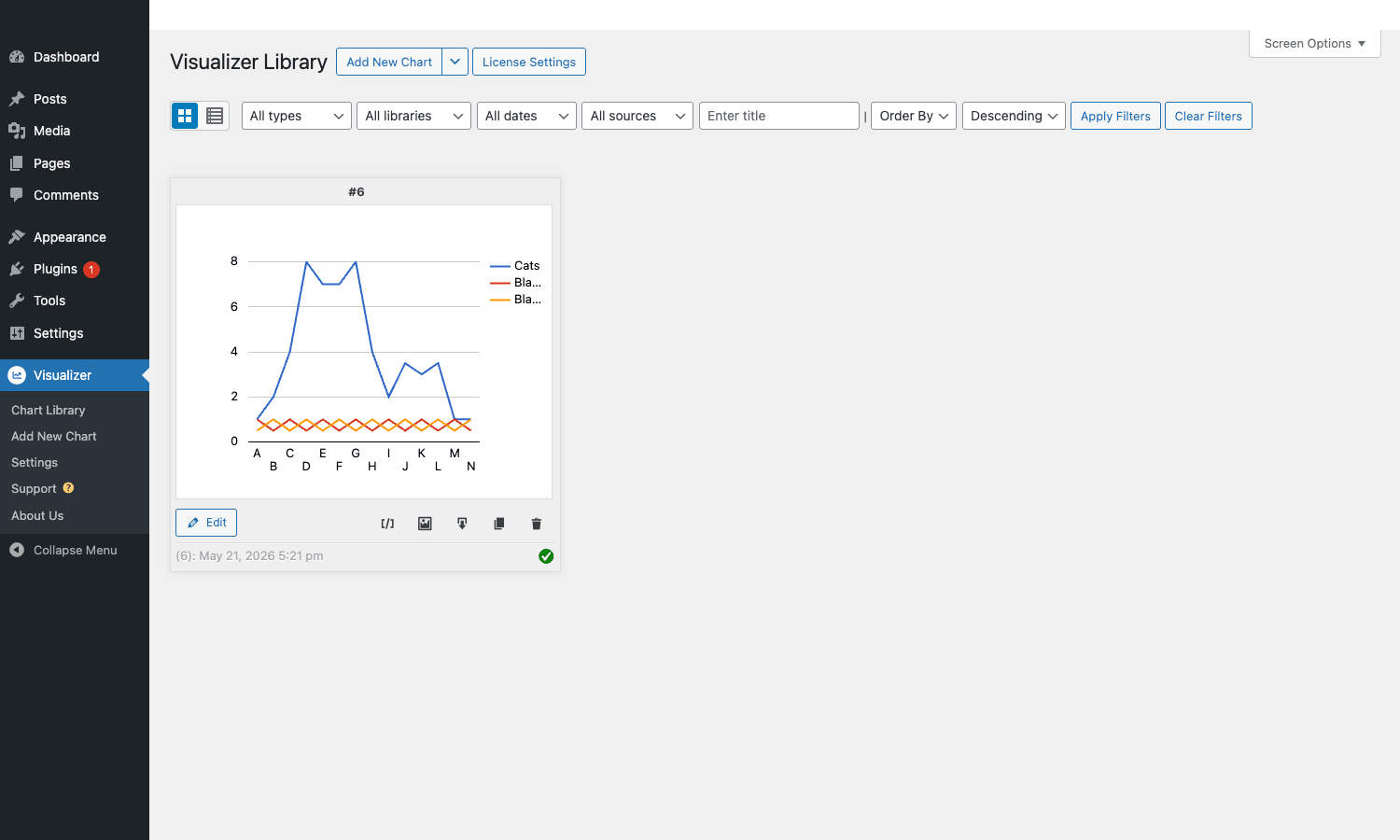
When you’re happy with the chart, click Create Chart at the bottom. The wizard closes and the chart appears in your library with a shortcode like [visualizer id="6"].
Picking the right data source
Visualizer’s strength is the breadth of input it accepts. Choose based on how often the data will change and where it lives.
Manual data
Best for: one-off charts where you typed the data once. Surveys, summary stats, demo charts. Edit any time by reopening the chart and clicking the data editor.
Import data from file (CSV / XLSX)
Best for: data that lives in a spreadsheet you control. Upload a CSV or XLSX, the plugin parses headers from row 1 and types from row 2. Re-upload to refresh.
Import data from URL (CSV / XLSX / Google Sheets)
Best for: data that updates on a schedule. Point the chart at a CSV URL, a published XLSX URL, or the Publish to Web CSV link of a Google Sheet. Combine with a sync schedule (One-time, Hourly, Each 12 hours, Each day, Each 3 days) and Visualizer will refetch on its own.
This is the option I use most. Keeping data in Google Sheets means anyone on the team can update it without touching WordPress.
Import from JSON
Best for: an API endpoint that returns JSON. Paste the URL, pick which JSON root to use (the plugin tries to autodetect arrays of objects), optionally configure a sync interval. The plugin supports pagination if the API returns a next-page URL or cursor, configurable via the visualizer_json_fetch_pages filter we’ll cover later. Authentication headers can be added via the visualizer_json_args filter.
Import from other chart
Best for: when you want two charts that share data. Pick an existing chart and Visualizer clones its data. Changes to the source still propagate if you set a sync.
Import from WordPress
Best for: dashboards that live alongside the content. Build a WP_Query right in the UI, picking post type, taxonomies, date filter, ordering, and which post fields to use as series. Set a sync interval and the chart updates as content is added or modified. Useful for things like "posts published per month per category" or "most-commented posts this year".
Import from database (Pro)
Best for: tables that aren’t WP posts. Custom plugins, e-commerce extensions, forms, anything that has its own table. The Pro database source ships with a visual query builder: pick a table, pick columns, optionally join another table, add WHERE clauses, set a sync schedule. The generated SQL is filterable via visualizer_db_query if you need to do something the UI doesn’t allow.
The free wpDataTables is another option for database-driven charts, but Visualizer’s database source is more focused on charts than tables, and the sync intervals are easier to reason about.
Embedding charts in posts and pages
Once a chart is in the library, you have three ways to drop it into content.
Shortcode
The simplest. Paste this into a Classic Editor post, a shortcode block in Gutenberg, or a Custom HTML widget:
[visualizer id="6"]
Replace 6 with the ID of your chart. Optional attributes:
classadds a CSS class to the wrapper.lazy="yes"defers rendering until the chart scrolls into view.dataandsettingsaccept JSON to override the saved data or settings inline (rarely needed).
Gutenberg block
In the block editor, click the inserter and search for "Visualizer Chart". The block has two entry points: Create a new chart, which opens the wizard in a modal so you don’t leave the post, and Display an existing chart, which gives you a grid of your existing charts to pick from.
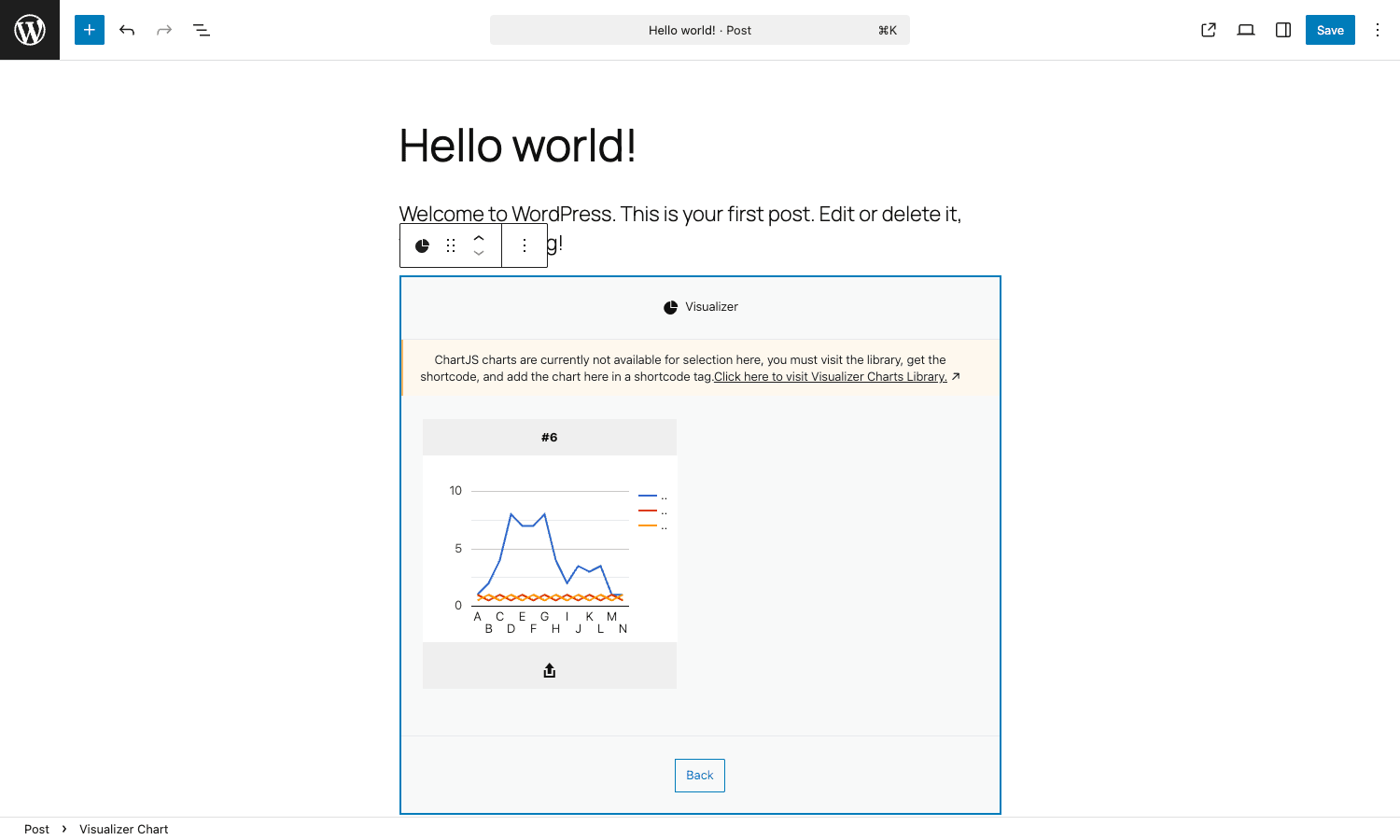
Once you pick a chart, the block previews it inside the editor, which is much nicer than staring at a shortcode placeholder.
Elementor widget
If you build pages in Elementor Pro, the plugin adds a Visualizer Chart widget you can drop into any section. Same chart picker, same options. Works equally well in any other page builder that respects shortcodes, including WPBakery Page Builder.
What the frontend looks like
This is the saved chart rendered on the public-facing post:
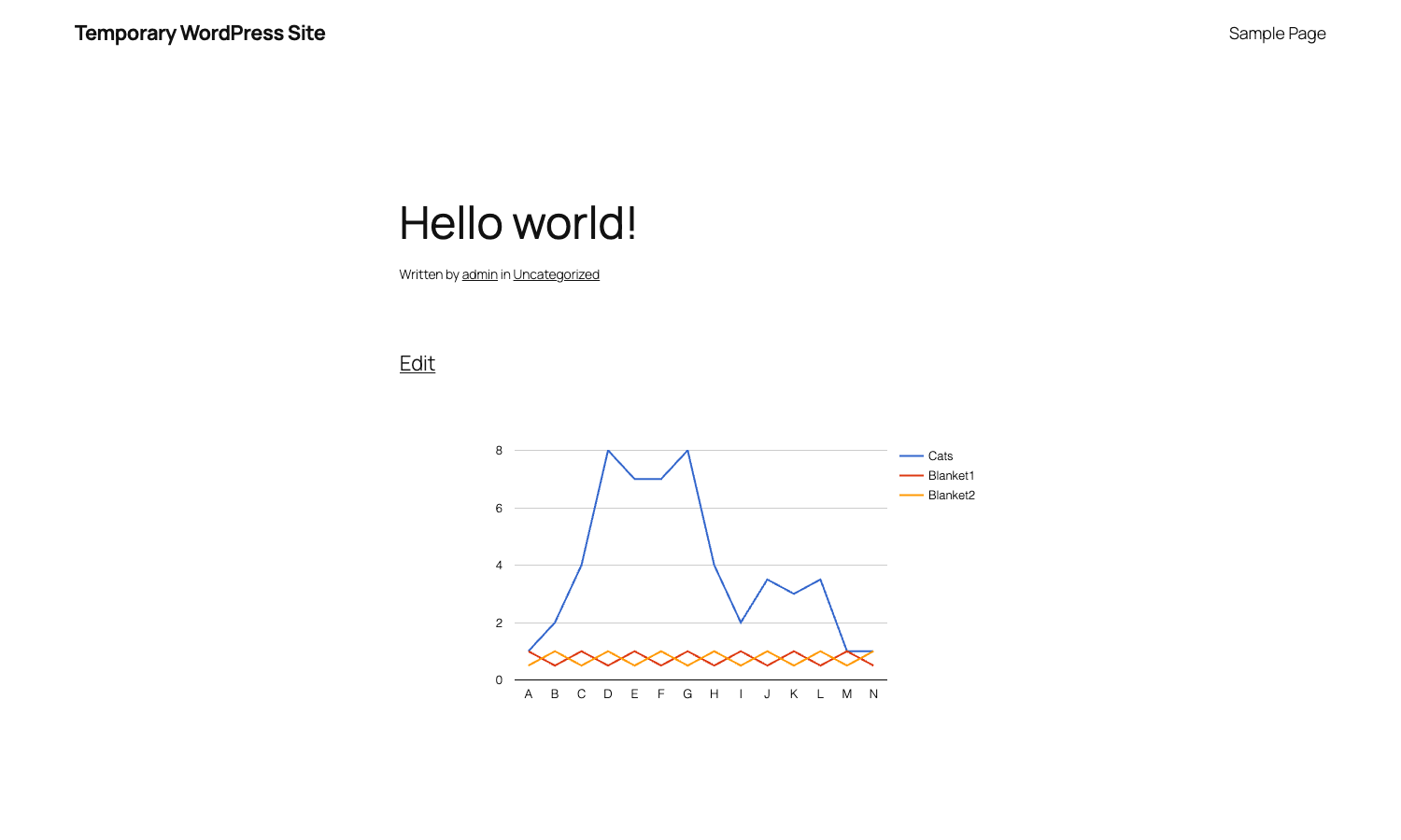
That’s the unstyled default with the Twenty Twenty-Five theme. The chart is real SVG that resizes with the container, the legend reflows on narrow screens, and hovering a point shows a tooltip with the exact value. With a few minutes in the Settings tab you can color it to your brand and add an axis title.
Global settings and per-chart styling
Visualizer keeps its global preferences light. Go to Visualizer -> Settings and you’ll see:
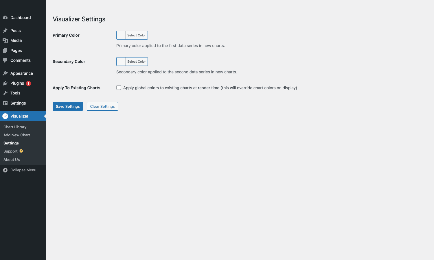
Two color pickers and one checkbox.
- Primary Color: applied to the first data series in newly created charts.
- Secondary Color: applied to the second series.
- Apply To Existing Charts: if checked, the global colors override per-chart colors at render time. Useful if you want a site-wide refresh.
Everything else is configured per chart in the chart editor. That’s intentional. A chart of conversion rates needs different colors than a chart of carbon emissions, and most plugins try to solve this with too many global options.
Real-world use cases
Five places I’ve used (or seen used) Visualizer that worked well.
1. Pricing comparison tables that look like dashboards. A DataTable chart with sorting and search beats a static table for any pricing page over five rows. Set the chart’s data source to a Google Sheet so non-developers can update it.
2. Live affiliate-program performance. Hook the chart’s JSON URL to your affiliate dashboard’s API, set a daily sync, and the chart on your blog refreshes each morning. Add the visualizer_json_args filter to pass an API token in the request headers (example below).
3. Polls and surveys. Import the results CSV from Google Forms, pick a column chart, set the title to the survey question. Five minutes from spreadsheet to publishable visual.
4. Reader-facing analytics summaries. A monthly "year in review" post showing organic traffic, top categories, and top posts. The WordPress data source means most of this needs no external service; combine it with MonsterInsights Pro if you want to mix in actual analytics numbers.
5. Embedded reports on a client site. Visualizer’s Pro database source connects to a custom plugin’s table directly. The client sees a live dashboard inside their own WordPress admin without you having to build a custom React app.
Developer reference: hooks, filters, and code
If you just want to use Visualizer in posts, you can skip this section. If you’re integrating it into a theme or a custom plugin, this is where it gets interesting. Visualizer exposes 70+ filters and 25+ actions. Below are the ones I find myself reaching for, with practical snippets.
Filter: customize chart container HTML
visualizer_container_attributes lets you add classes, data attributes, or inline styles to the wrapper div around each chart.
add_filter( 'visualizer_container_attributes', function( $attributes, $chart_id ) {
 $attributes['data-tracked'] = 'true';
 $attributes['class'] = ( $attributes['class']?? '' ). ' my-theme-chart';
 return $attributes;
}, 10, 2 );
I use this to attach an analytics tracking attribute so a separate JS file can listen for chart impressions.
Filter: force lazy load on every chart
By default, lazy loading is per-chart. Turn it on globally:
add_filter( 'visualizer_lazy_by_default', '__return_true' );
Or scope it to specific chart IDs:
add_filter( 'visualizer_lazy_by_default', function( $lazy, $chart_id ) {
 return in_array( $chart_id, [ 24, 31, 47 ], true );
}, 10, 2 );
Filter: change the cron interval used by scheduled imports
The plugin’s scheduled-refresh feature uses WP-Cron. The default interval depends on what you pick in the chart editor (One-time, Hourly, Each 12 hours, etc.). You can override programmatically:
add_filter( 'visualizer_chart_schedule_interval', function( $interval_key ) {
 return 'hourly';
} );
Combine with custom WP-Cron schedules to get intervals like every 5 minutes for high-traffic dashboards.
Filter: pass authentication headers to JSON imports
The JSON data source uses wp_remote_get under the hood. To call an API that needs a bearer token:
add_filter( 'visualizer_json_args', function( $args, $url ) {
 if ( false === strpos( $url, 'api.example.com' ) ) {
 return $args;
 }
 $args['headers'] = [
 'Authorization' => 'Bearer '. MY_API_TOKEN,
 'Accept' => 'application/json',
 ];
 $args['timeout'] = 15;
 return $args;
}, 10, 2 );
You can also customize how many pages the plugin will follow if the API uses cursor pagination:
add_filter( 'visualizer_json_fetch_pages', function( $pages, $url ) {
 return 20;
}, 10, 2 );
Filter: customize the SQL the DB source generates
Visualizer’s Pro database source builds SQL from the UI choices. If you need to add a join the UI can’t express:
add_filter( 'visualizer_db_query', function( $query, $chart_id, $params ) {
 if ( 42!== (int) $chart_id ) {
 return $query;
 }
 return str_replace(
 'FROM wp_posts',
 'FROM wp_posts INNER JOIN wp_postmeta ON wp_postmeta.post_id = wp_posts.ID AND wp_postmeta.meta_key = "_my_flag"',
 $query
 );
}, 10, 3 );
You can also cap the row count via visualizer_sql_query_limit (default 1000):
add_filter( 'visualizer_sql_query_limit', function( $limit, $chart_id ) {
 return 5000;
}, 10, 2 );
Filter: format chart data before render
When you want to round numbers, convert units, or substitute labels:
add_filter( 'visualizer_format_data', function( $data, $series ) {
 foreach ( $data as &$row ) {
 if ( isset( $row[1] ) && is_numeric( $row[1] ) ) {
 $row[1] = round( $row[1], 2 );
 }
 }
 return $data;
}, 10, 2 );
$data is a 2D array of [label, value, value,…] rows; $series describes the column types.
Filter: customize the WP_Query used by the WordPress data source
add_filter( 'visualizer_query_args', function( $args ) {
 $args['post_status'] = [ 'publish', 'private' ];
 $args['tax_query'][] = [
 'taxonomy' => 'category',
 'field' => 'slug',
 'terms' => [ 'reports' ],
 ];
 return $args;
} );
Useful when the visual query builder doesn’t expose every WP_Query argument you need.
Filter: override schema.org metadata
Each chart emits a JSON-LD block with name, description, license, and creator. To inject your own values without editing the chart:
add_filter( 'visualizer_schema_name', function( $title, $chart_id ) {
 return get_the_title(). ' - Chart';
}, 10, 2 );

add_filter( 'visualizer_schema_creator', function( $creator, $chart_id ) {
 return 'Your Organization Name';
}, 10, 2 );
Action: do something every time a chart enqueues
The plugin fires visualizer_enqueue_scripts_and_styles when a chart’s assets load on a page. Hook in to dequeue conflicting scripts or preload your own data:
add_action( 'visualizer_enqueue_scripts_and_styles', function( $data, $chart_id ) {
 wp_localize_script( 'visualizer-render-google', 'myChartContext', [
 'chartId' => $chart_id,
 'nonce' => wp_create_nonce( 'my-chart-action' ),
 ] );
}, 10, 2 );
Action: extend the chart settings UI
If you’ve built a custom chart type or want to add an extra setting to the existing UI:
add_action( 'visualizer_chart_settings', function( $class, $data, $section ) {
 if ( 'style'!== $section ) {
 return;
 }
 echo '<p><label>My custom option <input type="text" name="settings[my_custom]" /></label></p>';
}, 10, 3 );
You’d pair this with a save hook to persist whatever the user enters into the chart’s post meta.
Working with the REST API
Visualizer registers the visualizer post type with show_in_rest => true and rest_base => visualizer. That means you can fetch and create charts via the REST API like any other post type:
curl -X GET "https://yoursite.com/wp-json/wp/v2/visualizer" \
 -H "Authorization: Basic $(echo -n 'admin:app_password' | base64)"
The plugin also registers its own REST route (defined in Visualizer/Module/Frontend.php) for the front-end JS to pull chart data on demand. That endpoint is internal but if you want to build a JavaScript client that talks to it, the route name and signature are stable across releases.
Saving custom snippets safely
Adding the snippets above directly to functions.php works, but a child theme update can wipe them. A small code-snippets manager like Code Snippets Pro or WPCodeBox 2 keeps them as a separate, toggleable thing.
Performance, accessibility, and SEO
Charts that load slowly or break for screen readers can be worse than no charts. A few things to know.
Performance
- Each chart loads the Google Charts loader (or Chart.js, or DataTables) and the chart’s data. The first chart on the page is the expensive one; additional charts on the same page reuse the loader.
- Lazy loading defers chart rendering until the chart scrolls into the viewport. Turn it on for any chart below the fold. The setting is in the chart editor’s Settings -> General section.
- The Pro option to Save inside media library rasterizes the chart to a PNG and stores it. Used for AMP fallbacks and shareable previews.
- If you use a caching plugin like WP Rocket, exclude the Visualizer JS files from the Combine JavaScript option. Combining sometimes breaks the Google Charts loader sequence.
Accessibility
Visualizer’s frontend output includes ARIA labels on the chart container and a hidden table fallback for screen readers when the underlying library supports it. Google Charts has reasonable defaults; Chart.js requires you to enable an a11y plugin if you need full WCAG compliance.
Practical advice:
- Always set a chart title in Settings -> General. It becomes the accessible name.
- Use chart Description (under General) for a one-sentence summary that screen readers will read.
- Pick color palettes with enough contrast. Pie charts with five pale slices are unreadable for many people.
SEO
Two things to set per chart:
- Chart title and description under Settings -> General. These flow into the JSON-LD that Visualizer emits.
- License and creator if the chart is reusable. Visualizer outputs a
Datasetschema with these fields when filled in.
The chart data itself is rendered into the DOM via JavaScript, so most search engines see only the wrapper. The schema.org JSON-LD compensates by exposing the chart’s title, description, and creator as structured data. If indexing the underlying data is critical (a chart showing 50 data points you want searchable), include a written summary of the highlights in the surrounding paragraph.
Pricing and what GPL Times provides
Visualizer has two tracks:
- Free version on the WordPress.org plugin repository. Includes all the basics: manual data, CSV/XLSX upload, JSON import, sync schedules, lazy loading, shortcode and block, the most common chart types (line, bar, pie, area, geo, column, scatter, table, gauge, candlestick, timeline). Good enough for most blogs.
- Pro (paid, Themeisle). Adds the database source, more chart types (combo, polar area, donut, bubble in Chart.js), per-role permissions, frontend chart editor, scheduled imports on shorter intervals, premium support.
Themeisle sells Pro on annual and lifetime plans, tiered by number of sites.
It is the same plugin code that ships from Themeisle, distributed under the GPL terms the plugin is already licensed under.
Frequently asked questions
Does Visualizer work without the Pro addon?
Yes. The free version, available on the WordPress.org repository, handles most use cases. You only need Pro for database imports, the extra chart types, scheduled imports below the daily threshold, frontend editing, and per-role permissions.
Can I import data from Google Sheets?
Yes. Publish your sheet to the web (File -> Share -> Publish to web -> CSV), copy the published URL, and paste it into the chart editor’s "Import data from URL" panel. Set a sync interval and Visualizer refetches automatically.
Are charts responsive on mobile?
Yes. The chart’s container is fluid, and both Google Charts and Chart.js redraw to fit. Some chart types reflow better than others; pie charts work great on phones, geo charts can feel cramped under 400 px wide.
Will visitors see my chart if JavaScript is disabled?
No. The chart libraries render with JavaScript, so a JS-disabled visitor sees the wrapper but no chart. Visualizer falls back gracefully (no error message, just no chart). For AMP pages, the AMP module renders a static fallback.
Can I customize chart colors site-wide?
Yes. Visualizer -> Settings lets you set Primary and Secondary colors that apply to the first two series of every new chart. Check "Apply To Existing Charts" to override per-chart colors at render time.
Does Visualizer support WPML or Polylang?
Yes. Chart titles and labels are stored in WordPress’s translatable structure. Both WPML and Polylang detect them automatically.
Can I export the chart as an image?
Yes, the frontend "Download Image" button rasterizes the chart to PNG. There’s also a Pro option that stores a rendered PNG in the media library each time the chart is saved.
Does the plugin slow down my site?
It adds 50-150 KB of JavaScript per page that has a chart. With lazy loading enabled, that cost is deferred. If you have ten charts in one post, expect a noticeable load increase; use one or two charts per post for best performance.
Can I have charts on Elementor or WPBakery pages?
Yes. Visualizer registers an Elementor widget out of the box. For WPBakery Page Builder, use a shortcode block, or for a richer experience an Essential Addons text editor.
What’s the difference between Visualizer and wpDataTables?
wpDataTables is primarily a table plugin that also makes charts; Visualizer is a chart plugin that also makes tables. wpDataTables has stronger table features (editable tables, server-side processing, joins). Visualizer has stronger chart features (more chart types, cleaner editor, native Gutenberg block). If your content is mostly tabular, pick wpDataTables. If it’s mostly visual, pick Visualizer.
Final thoughts
Visualizer is the chart plugin I keep coming back to. The free version covers the common case, the Pro version unlocks what you need when you graduate to live database imports and team permissions, and the filter surface lets you bend the plugin to fit anything custom.
The things I like most after using it for several articles:
- Live sync from Google Sheets means I don’t have to log into WordPress to update a chart.
- The schema.org output is one of the few chart plugins that thinks about SEO at all.
- The hook system is deep without being overwhelming. Most of the filters are well-named and you can guess what they do from the name alone.
- The Gutenberg block is well-built and previews charts inside the editor, not just a placeholder.
If you’ve been using PNG screenshots of charts, give Visualizer one Saturday afternoon. You’ll spend an hour rebuilding old charts and the rest of the day wondering why you didn’t switch sooner.